Creating My Sword, Environment & Final Animation
- Mikey Owen
- Jan 15, 2023
- 14 min read

Updated: Jan 21, 2023
We can now move onto the final stage of my Data Capture 2 assignment - The creation of my final environment (including the sword asset) and ultimately the final deliverable.
In this post I'd like to breakdown the creation process for the sword asset & environment, as well as detailing the techniques I applied to enhance the lighting & overall cinematic composition of the final animation.
The Sword
As you'll recall from my previous post/s; I have a fairly good idea of how I'd like the sword asset to look. I therefore set to work creating the model, beginning with a simple block out in Autodesk Maya.
Beginning with my sword concept as a base; I used standard primitives (such as cubes and cylinders), added new divisions and loops, then manipulated the vertices and polygon edges for them to create the low-poly model you see below:

I'm already quite happy with how the sword asset is looking at this early stage! But it certainly needs more detail, particularly in order to not look out of place when dropped into a scene of high quality, photo-real assets!
Due to this, I decided to to take the block-out model into Zbrush where I could sculpt some intricacies into the hilt & grip. I added some divisions to the model to increase the poly count (and therefore give me more geometry to 'play with'), then used the sculpting tools to add some wrap around the grip, as well as raised 'gemstones' to the hilt and engravings to the surrounding surfaces.
I've once again included a screenshot of the sculpted model below for your reference to see the evolution from the previous section:

Now all that remained before my sword was 'scene-ready' was to add some textures to the model. To do this I took the sculpted asset back into Autodesk Maya to create UV maps for the various parts of the sword, then exported it into Adobe Substance Painter for texturing.
I always highly enjoy the texturing process, and this time was certainly no different. I began with the blade, using an existing shining material that came as standard in substance painter. From there I added a darker iron material and painted it onto the center of the metal. This way the edges of the blade were distinctly lighter, giving it the appearance of being far sharper and almost magical due to it's cleanliness.
I then moved onto the hilt, using a brilliant gold, but then also a darker bronze with an edge generator so it fell into the recesses of the engravings. I then painted a ruby, emerald and sapphire material onto the 'gems' and moved onto the grip. The grip was simple to achieve a desired result thanks to my hind sight of sculpting a wrap onto the surface. I used a dark leather for the base, with an even darker shade painted onto the higher points with an edge-wear generator once again. Lastly for the end of the grip I used a gun-metal iron material, and painted gold onto the raised areas to complete the asset!
I've included a test render of the textured sword below so you can see the final effect which I'm really pleased with! Just as a quick note, I did of course experiment with adding rust and wear to the sword. But because I wanted it to appear enchanted like the sword of legend it's based on, this cleaner look felt more in-keeping with this theme:

With the sword now complete, I could turn my attention to the environment which will house it!
Creating the Final Environment
With everything now in place I could move onto the creation of my final environment! Before beginning this though, I'd like to pre-face this with a personal life issue that arose during the production of this environment. It's not my intent to use this as an excuse, more to help the reader of this blog understand my reasoning for making compromises during this phase.
Around the middle of November, shortly after the submission of my first Data Capture assignment, I was sat at my desk and suddenly found myself unable to breathe properly. My heart rate increased to a level where I could physically see it beating when looking at my chest, and I felt on the verge of fainting. Unfortunately I was alone in my flat at this point, but managed to make it downstairs to the car park where I was able to ask my neighbor to call me an ambulance.
Once the paramedics arrived, I was sat in the back of the ambulance for what felt like a very long time, while they waited to see if my heart rate would naturally lower or if they needed to take me to hospital. Thankfully they were able to keep me calm and eventually my heart rate returned to a normal level. These attacks unfortunately happened again 3+ more times over the coming weeks and holiday period. I was also unfortunate enough to contract Covid-19 while visiting my GP following another one of these attacks.
Due to the above, I've been left over a month behind on my studies. My tutors were incredibly understand with my submission, but I have had to evaluate what is most crucially important with this assignment in order to catch up as quickly as possible and avoid any further delays to my education.
With the above in mind, I'll now move onto how I created my final environment. I've broken this section down into 3 stages to assist with comprehension.
Adding Photogrammetry Assets
Using my previzulisation environment as a base, I decided the first thing to do was to add in my photogrammetry assets to take the place of the white-cube block outs that were currently there.
I therefore imported my cleaned-up, high quality meshes (detailed in the previous post and data capture 1 assignment) into my Pre-Viz unreal engine project. From there I ensured the textures were working, and added them to the scene in their designated locations by using my storyboard as base. I then had to make a simple adjustment in the Unreal menus for the assets themselves; making them 2-sided to avoid any lighting shining through the empty meshes on their back side.
Already the environment appeared to be taking shape, and I was excited about the final result! I actually ended up using my assets more often than I originally intended so they fill out the majority of the final scene.
Unfortunately due to the health issues discussed in the above section; I don't have any screenshots available for this stage of the production (due to the urgency with which I produced the environment). I was very eager to build the final environment and removing the 300+ meshes that surround my photogrammetry assets would be too time consuming. I instead choose to devote the remainder of the assignment's run time to polishing the quality of my final environment and animation deliverable.
Adding Pre-existing Assets
I then added the pre-existing assets discussed in the previous post to my Unreal project. Starting with the ancient ruins and ancient temple packs.
These packs added some wonderful pillar assets which make up the main bulk of the additional geometry in my scene. These were placed with care in areas which would 'hide' the seems on the photogrammetry assets where the geometry had been limited by lack of references during the creation process. Additionally they made for some wonderful scene decoration to really nail-down the aesthetic of an ancient temple!
This asset pack also came with some great foliage like large ferns, bushes and trees! So these were placed along the ridge line above the temple entrance, with some of the smaller bushes being used to populate any empty grassland terrain around the environment.
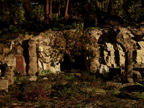
The real star though were these hanging vine assets that came from the ancient temple pack! I wanted this temple to look like it had been undiscovered for hundreds of years, but the photogrammetry asset of the entrance I was using was simply a large square opening. It was very hard to believe that this would simply go unnoticed for such a long time, so I placed these vines hanging over the opening and it instantly brought some much needed realism to the location!
After using the above packs; I turned to the fantasy forest pack to further populate the ridge line in the opening shot and added some more variety to the foliage throughout the scene. The trees included in this pack were wonderful high quality meshes and really added a lot to the ridge line! The foliage included was lush & green, and really brought the vegetation to life! Like with the above packs though, there was one stand out inclusion which really helped shape the environment; a built in Niagara particle system which generated leaves falling to the ground. This system made this dense forest seem so much more alive! Adding some secondary movement to an otherwise static scene was a real game changer!
Lastly, with the majority of the scene constructed now, I turned to Megascans to 'fill in the gaps'. I found some incredible sandstone assets with highly detailed geometry, as well as some more foliage that I could scatter across my scene. Once I'd placed the foliage and was happy with the vegetation of the scene, I discovered that the sandstone assets I'd brought in were distinctly darker than the rock that photogrammetry assets were comprised of. I went back to Quixel Bridge to see if there were any rock formations closer to my assets, but unfortunately couldn't locate any. This is where I had the idea to simply open up the megascan asset's materials and mess with their respective values to manually adjust the colour of the rocks!
Megascans, as well as static meshes, also includes some wonderful realistic materials that you can import into your Unreal scene. I therefore brought in materials for forest ground terrain of various densities and colours, as well as rock materials, and applied them to the white pre-viz geometry I'd created to act as the flooring. I'm really happy with the end result!
I'm surprised to say this actually worked perfectly! Adjusting the brightness of the base color texture in particular really had a great result! With these assets now usable within my scene, I set about filling in the gaps around the cave. I covered up any visible areas where seems of assets met, placed them within existing meshes to add some variety to them if they'd been reused in several locations etc. then the environment was essentially complete! There was however one more stage to go before it was 'camera ready'.
Once again I'd like to mention here that due to the urgency of this submission, I am left without screenshots and examples of this asset placement. I have however done my best to summarize the processes I used above, but please rest assured that I approached this section of the environment creation with the utmost care. Ensuring the environment looked realistic from all angles, that not a single asset was out of place etc. Hopefully the final frames at the end of this section will reflect this. I have at least included a top down view of the ridge-line which you would not normally see during the animation to give an idea of the assets I used and their placement:

Final Adjustments
Now that the final geometry of the environment was complete, it was time to add the finishing touches and cinematic flair to the level to maximize it's realism for the final cinematic. I can break these down into 3 sections: lighting, volumetrics and effects.
Lighting
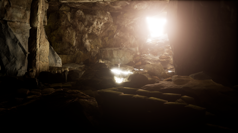
Starting with the lighting, I decided to remain with Unreal Engine 5's default lumens lighting system for the sunlight. This added some wonderful clarity to my scene, and the ability to easily manipulate the position of the sun so that it was shining directly into the cave onto the sword was invaluable!
I did some issues with the interior of the cave (more on these below), with the primary one being that the sunlight now shone through my photogrammetry assets. As they were primarily captured from the front, their back faces were completely transparent and allowed the free-flow of the lighting into spaces which should be in shadow. I was able to combat this thankfully by enabling 2-sided lighting under the mesh settings for each of my assets. There were also some issues with gaps in the geometry where light was shining through, and covering these with other static meshes would have ruined the overall look of the scene. I therefore placed some light blocking black cubes around the underside and exterior of the cave to prevent the sun passing through. I've included an image of this idea in practice below:

Unfortunately this resulted in another issue with the interior scenes. I now had a complete lack of lighting, meaning absolutely nothing could be seen within the caves. Even though this technically is a realistic reflection of how this environment would look in real life, it's hardly appropriate for a cinematic showing off the painstaking environment I created.
I initially tried torches (more on that below in the effects section), but these had their own issues. It's then I decided to simply use post-process volumes to drag out a space where the camera's exposure levels would sharply increase when it enters it's boundaries. I created two of these: one for the main bulk of the interior, and one for close up to the sword where the exposure would be slightly lower (as the increase in brightness along with the sunlight reflecting off the sword's blade practically made it pure white).
These were then brought right up level with the entrance of the cave, so that when the camera passes through it it will accurately reflect the human eye's adaptation to different light levels. Admittedly in practice it's far faster than the human eye can adapt, but I felt I could take some liberty here in order to ensure that it aids the cinematic and the original purpose of displaying a high quality environment.
I've included a before and after of the entrance to the temple showing the post-process volume off & on:


This concludes the lighting adjustments I made to the base environment. I'll now onto discussing the volumetric side of things and the small but effective tweaks that aided the final cinematic.
Volumetrics
This section will be far shorter than the other two, but is by no means less impactful. In terms of volumetrics, I simply applied some atmospheric height fog to my scene and made adjustments to the sky atmosphere.
This fog allowed me to add some subtle mist to my environment, causing the lighting to dance realistically across the surfaces, whilst the atmosphere changes adjusted the overall exposure and colorization of the light to reflect a more realistic look.
Lastly, it added some ever-so-subtle god-rays of the light between the trees and shining down into the cave. It really did make such a huge impact! I've included a screenshot below of the opening frame before and after the fog and atmosphere were added:


I think the photos really speak for themselves! Such a simple change really added a huge layer of realism to the shots. Without the volumetrics the lighting just looked too 'clean', and simply white. The extra colour of the second image makes it far better to look at in my opinion.
Effects
This section should really be far larger than it is. You may recall in previous posts (regarding the storyboard in particular), that I intended to add torches to the interior of the cave, as well as a flowing waterfall and lake surrounding the sword in the inner chamber. Unfortunately in execution some sacrifices had to be made.
Regarding the water first off, this simply boils down to the medical reasons detailed above. When it came to finalizing the environment I'd only been able to complete minimal research into this effect, and what I'd discovered was incredibly complex in order to achieve the result I wanted. I therefore made the difficult decision to omit this water system and instead explore this effect for future projects. I don't feel it impacts the appreciation for my environment, in fact in some ways this allows the audience to keep the focus on the photogrammetry assets where it should be, but I digress.
For the torches however, this was down to creative choice. I was able to locate some wonderfully realistic fire simulations that lit the scene well and allowed plenty of customization, but they simply just didn't show off the environment in the way I wanted to. It kept the focus on the small patches of the cave that were lit by the torches, but left the areas like the back walls and floor terrain that I'd spent days painstakingly crafting in the dark. I've included a screenshot below for your reference:

Just to note, I did try a combination of the post process volumes mentioned above and the torches, but the exposure adjustments just completely washed out the light from the flames. Hopefully the above image helps you to understand my thought process though. As much as I loved the colour and atmosphere of lighting the scene via flames, I really wanted the viewer to see this scene I'd worked so hard to create in all it's glory.
The one effect I was actually able to keep in from my original concept though was the small embers and smoke trail applied to my campfire asset! This was really simple to add; a quick fire effect, with the particle sizes at the beginning and end of their life-cycle adjusted to create a smolder, followed by a scaled down smoke particle system over the top! I've included a screenshot below showing this in action:

That brings us to the end of the environment creation. All that remained now was to complete some slight adjustments to the camera, then render my final animation!
Creating The Final Animation
It was now that I could begin the creation of my final animation, though I quickly had to make some subtle adjustments to the camera system leftover from my previs in order to adapt it to the new geometry.
First off was the positioning of the rail which the camera ran on. I originally anticipated the ceiling to be far lower and the rocks littering the ground to be far smaller. I therefore had to adjust the position of the rail so that it flowed smoothly through the cave, only dropping low to move under the vines at the entrance and high to avoid the rocks on the ground.
Next I researched the facility to have the camera 'look-at' an object. In the previs I manually adjusted the cameras rotation every few frames to look at the sword in the closing sequence, but knew there must be a better way than this time consuming method. I discovered documentation online about the look-at functionality, which allowed me to select a mesh within the scene and the camera would remain fixated on it. I chose the hilt of the sword, completed some adjustments to the offset so it was framed better, then added this function to the sequencer. This allowed me to keyframe the look-at function so it only activated when the camera enters the final chamber.
Lastly, I added a subtle depth of field to the camera. This realistically blurred the trees in the background of the opening shot to give the impression of them being much further away than they actually were. A simple effect, but it really made a difference!
Rendering
In terms of the final renders themselves, I wanted to explore the best settings possible for my project that could really heighten the final cinematic. Previously I'd just used the default Unreal Engine sequencer, messing with the modifiers to adjust exposure and the like, before rendering the cinematic as an image sequence.
This time, and for the sake of future projects, I wanted something more professional. It's during this research that I discovered this tutorial I've included below:
The gentlemen giving the tutorial I found to be incredibly insightful, and found their instructions invaluable. It redirected me to an Unreal Engine document which listed key render settings that you could add to a plug-in called Movie Render Queue. This plugin could be enabled simply within Unreal Engine's plugin menu, requiring only a quick restart to activate.
From there I chose my image format (opting for png for minimal compression), my framerate and resolution (1920x1080 as per the brief and 60fps for personal preference), and the additional settings as described in the tutorial. This massively increased the time required per frame render, but I am really pleased with the results!
The Final Animation
So then, without further ado, please find below my final animation submission for my Data Capture 2 assignment:
Honestly, I'm saddened that this didn't live up to my original vision for this cinematic. I wish I'd had more time to implement the effects I wanted, and the final animation has some odd background lighting shifts which weren't apparent during test renders. To this day I have no idea why they occurred or how to fix them (I attempted to remove the fog, atmosphere, returned to default render settings etc but to no avail).
However, I think given the issues I personally have faced for more than 3 quarters of the total time allotment for this assignment, I do take some pride in what I've created. This was first experience in producing assets from photogrammetry and attempting to build a scene around them, and whilst the animation isn't perfect, the scene itself was extremely fun to produce. I'm hoping my commitment to this assignment despite what I've faced reaffirms my commitment to the CGI industry, and I'm looking forward to getting back into the swing of it!
To round off this post and assignment in general, I've included some high quality stills from the animation below so that you can view them in more detail:


That brings an end to my second Data Capture assignment, and indeed the Data Capture module as a whole! I now move onto my VFX assignment and additional work towards my final project for the year.


Comments