Existing Media Research & Final Concepts
- Mikey Owen
- May 25, 2024
- 10 min read

Before beginning production on my final project, there's one more area of key research I need to complete. I've looked into books previously, but given the nature of my project which is a 3D animation rather than a written piece, there's an argument that researching existing media is just as, if not more important. than literary research.
To that end, I'd like to research some existing media in the forms of TV shows, movies and video games which I can use to influence the design of my final animation. Everything from environment, lighting, pacing and colour scheme.
I've scoured my extensive library of shows, movies and games and selected 4 which I think will make amazing influences for project. I'll break each of these down below, followed by an evaluation on what I've taken away from them and how I will apply it to the design of my final animation.
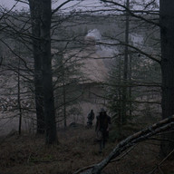
The Walking Dead
The Walking Dead is originally a post-apocalyptic comic book series written by Robert Kirkman, but anyone familiar with the name is more likely familiar with the TV series on AMC. It is the TV show version of this IP that I intend to research to influence my final animation.
The Walking Dead already bears a similarity with my project due to the inclusion of zombies, although The Walking Dead is based in present day as opposed to my animation which is based in the mid thirteen hundreds. However, time differences aside, the show focuses on the horror of what a zombie apocalypse would be like and the lengths people would go to to survive, in a way which no media had done before. This is ultimately what led to the striking popularity of the early seasons of the show, as well as the green light for multiple spin offs currently in production!
In terms of how I want to use The Walking Dead to influence my animation, it's two fold. The show's approach to zombies being the primary one, but also the unique colour grading the show features. It always has a distinctly de-saturated look the scenes, something which I strongly wish to replicate in my own work. This colour grading adds to the desolation of the environment and isolation of the characters. It's almost like a muted sepia if I had to put it into words! I've included some reference images below which will hopefully communicate what I mean:


As for the zombies, the way in which they move and their general presence whenever they're on screen is what intrigues me. The zombies in the show are the classic "slow movers", which the truly scary movies tend to move away from, as a slow moving threat is an easily avoided one. However the show is able to retain that fear factor due to just how imposing the zombies look, coupled with their numbers easily reaching the hundreds! Additionally, they have an uncanny ability to appear seemingly out of nowhere. Avoiding noises until their 'prey' is in sight, or simply popping up around every corner or behind every door! I'd love to be able to incorporate this fear factor into my own zombies, so would like to explore how I could do so in the bullet pointed list below:
Adding more 'unnatural' movements to their animations. This will add an element of fear as they move differently to traditional zombies. Perhaps twitching, jerking their head from side to side etc.
Editing their UVs in Photoshop to make them as grotesque as possible. Adding multiple wounds, blackening their eyes etc. Whatever makes them look as terrifying as possible.
Resisting the urge to add a multitude of 'groans'. Their eerie silence and how they effectively 'sneak up' on the survivors is what works so well in the show.
Exploring the use of crowd simulation to increase their numbers. I'd originally planned for a small group of say 6 or 7 zombies for the closing shot. But if I was able to increase this number to something much larger to emulate the hordes seen in the show without detriment to the amount of memory required this would greatly help to make them more imposing.
That brings me to the end of this research section, and I can already think of some wonderful ways to implement what I've discussed here! For now though I'll move onto the next subject.
Resident Evil 4: Remake
The original Resident Evil 4 was a videogame produced by Capcom and released in 2005 for the Nintendo Gamecube. It's a game I spent hours with as a teenager, and it's heavily influenced my taste in media today! I'm actually choosing to focus on the recent remake of the title which released for current generation hardware only last year. The reason for this is that the remake was heavily faithful to the original product, but simply has greatly enhanced visuals. These enhanced visuals will allow me to directly influence my project with a lot more clarity, rather than using the dated technology (though by no means less effective!) of the original release.
Resident Evil 4 follows an American agent as he searches for the President's missing daughter. This search leads him to a fictional village in Spain, where unfortunately the locals are infected with an unknown plague which leads to them becoming violent and slowly deforming into monstrosities as the infection takes hold. This media is once again set in the present day, but the village in which the early section of the game takes place actually shares a lot of similarities to medieval towns due to the villagers lack of technological advancements.
I've always loved the design of the village from the game, it makes a great opening sequence, and anyone who has played the game or watched game-play from it will instantly recognize it. I'd love to take the eerie design of this village and the tone the developers convey through it as influences for my own animation. I've included screenshots from the game below to hopefully convey what I mean:


As you'll see from the images (aside from the ones taken at night), there's actually a striking similar colour pallet to that 'off sepia' of The Walking Dead. I'm beginning to connect the dots here on what could be a great influence on the colour scheme of my final design! But I digress, there's more to examine here. I've made a short bullet point list below of my takeaway points from these images:
Volumetrics, particularly fog have worked wonders at making the location seem eerie and mysterious. Applying this to my environment could do the same.
The reason the buildings fit so well is because they're all serviceable, but clearly in some state of disrepair.
Fire works as a great contrast to the muted colours of the surroundings.
Thick trees with no leaves adds another layer of horror to the environment, removing all life from the surrounding plants has a similar effect on the villagers.
Another research point down and I really feel like I'm starting to nail down an artistic vision for how I want my final animation to look! Just a few more to go and I'll be able to create some finalized concepts to build on.
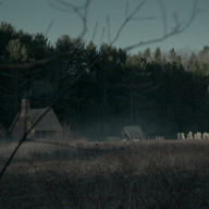
The Village
The next media to research on my list is a movie, The Village, directed by M. Night Shyamalan. This is a horror/thriller that premiered in 2004 and was actually the first movie I saw from this director!
The plot features a small, remote village in the american wilderness that lives in fear of nameless creatures which inhabit the surrounding woods. A blind woman must abandon the safety of the the village in order to find medicine for her lover, and therefore must face the monsters outside the walls. The villagers are naive to the ways of the world, so like with the previous reference, the town itself is somewhat 'stuck in the past'.
This movie also features a similar colour pallet as my previous two references, so perhaps this is why it has ended up on my radar! I've included some reference images below to further illustrate this:


It's only looking back at these images when they're all organised together I really notice one key highlight of this pallet. The colours of the woods themselves are so muted, that when any other colour is present it looks incredibly vivid in comparison.
I actually really like this effect, it keeps the audiences attention on the characters, and allows colour to be used to indicate emotion and alignment (yellow character good, red character bad for example). It's an interesting approach, and I'm excited to explore how it could be used in my own animation! As with before, I've listed my findings as a reference in a short bullet pointed list below so I can refer back to it later:
Dropping the saturation of the environment colours could assist in helping the characters standout in contrast. This could be an interesting thing to explore, even if I change the character colours from being the standout ones to perhaps blood? Or light from a fire?
The lighting of the sky also appears very muted, and in the case of one image, very vivid and orange. The colour of the sky could be used to great effect to set the tone of the piece.
Something which isn't evidenced by the images, obviously, is how well the movie uses silence to build tension. It has a great score, but given that the protagonist is blind, the monster moves silently to pursue them without being 'seen'. It works great for tension building in the movie and I could use this in a similar way!
I'm excited to employ some of the above points into my final animation to influence it's visual style! But have one more media to research first before moving on.
The Witch
The Witch is a folk horror movie from 2015 directed by Robert Eggers (and was in fact his directorial debut!). It's a movie I've attempted to watch before closer to it's release, but at this time didn't feel I 'got' it.
The movie takes great care to have the characters speak in a way which is historically accurate, and the pacing of the movie is very slow as it builds and builds. At the time, my attention span wandered far too quickly, but I recently went back to watch the movie through as a whole and I am certainly glad I did.
I've never had a horror movie make me feel quite as uncomfortable as The Witch does towards it's closing moments, and the parts which put me off previously (the historically accurate dialogue, the slow pacing) are actually what keep you invested in the world the director crafted.
The tone of the movie as well is possibly the best example I've seen of using the colour pallet to convey tension and fear. I've included some reference images below which should hopefully convey what I mean:


See how the colours are so muted, it gives the entire movie this depressing, hopeless feeling, which in turn perfectly matches the narrative. This is actually due to the fact that director shot only "with natural light and indoors, the only lighting was candles" in order to give the film an authentic feel.
I really do think this movie is almost a perfection of the points I've been taking from the previous research material. I'd love to try and replicate this form of lighting as best I can for my final project. I see no need for a bullet pointed list here as I've done with the other media because I've gone into detail on my main point and how I wish to apply it.
With this research phase now complete, and my excitement to adapt what I've learned here into my project high, I can now move onto producing some final key concepts before production begins!
Moodboard, Colour Pallet & Lighting
The next step with my research material now I've established how it can influence my project is to compile them to create a mood-board for reference. From there I can compile a colour pallet to use for my final animation, and then complete some lighting concepts to establish a workflow for emulating the de-saturated tones that I was so fond of above.
We'll begin first with the moodboard. I took all my reference images into Photoshop and created the below piece:

As you can see from the mood board, when the reference images are all side by side there is a very clear prevailing colour pallet. The dark, misty skylines, the off-sepia filter that I mentioned, the strong blues of the night time, the intensity of any light sources like fire etc.
This is doing a great job of helping me build a definition for the aesthetic of my final scenes, though to further help with this I used the eyedrop tool of Photoshop to take the most prevalent colours and created the below pallet:

This colour pallet will be an invaluable tool to refer back to during the creation of my final animation, especially during the colour correction process of post-production! I'd love to able to replicate the mood and lighting of my research material as best I can in my own animation, as I really feel it's going to enhance the tone and tensity of the scenes.
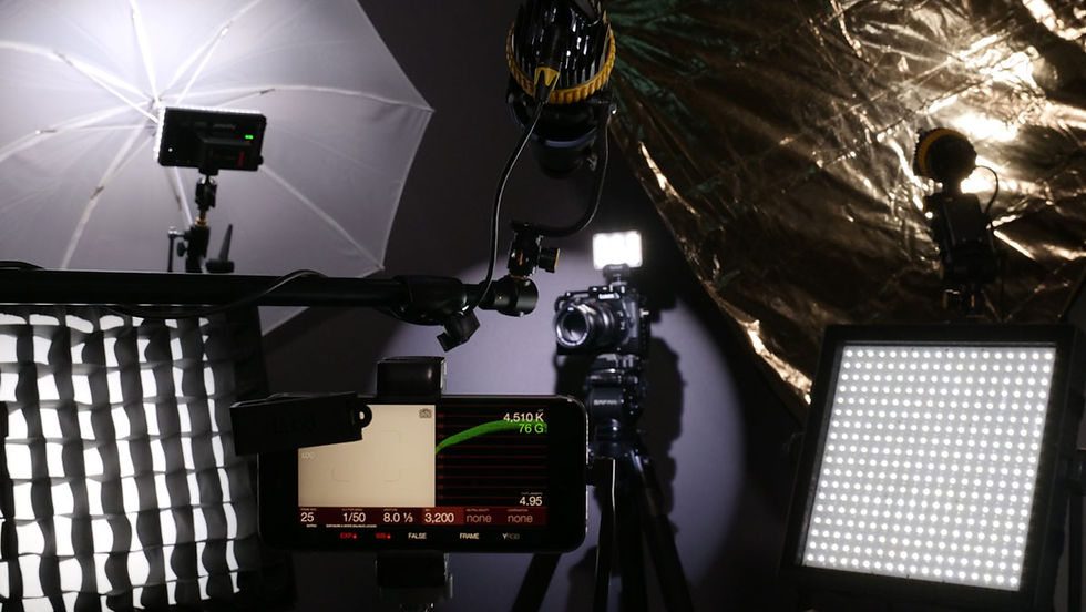
To help with this even further, I'd like to complete a short exercise to get some practice in for manipulating images to try and replicate the lighting of my research images. I went and took 3 photos on a sunny, clear day, 2 outside and 1 indoors. The colours are strong and vibrant, so I'll need to do a fair amount of editing to try and bring them down to the de-saturated, muted look I'd like to achieve. To do this I'll take them into Da Vinci Resolve, which will be my post-production software for the final animation, and alter their contrast, colour highlights, temperature & saturation to try and achieve the look I want.
I feel like I've made a pretty good attempt at replicating my references, and feel this practice will help massively with creating an effective colour correction workflow for post-production. I've included comparisons of the before & after editing of my images below for your reference so you can see my results:


I think I've managed to achieve the result I wanted, and I've now got a concrete workflow for colour correction ready to go for the animation (provided of course that I can't achieve this effect in render).
I've included a bullet point list below of the steps I took in Da Vinci to create these edits so that I may refer back to it later:
Create new node under colour panel and label contrast. Use this to darken the shadows, but overall up the exposure of the image, this will flatten the colours.
Create a new node titled colour correction. Use this to half the saturation and lower the temperature until the image looks like it's been taken on a cloudy day.
Use curve editor to lower the highlights of each option, but try to keep blue as the prevailing colour.
Use a circular mask to create a vignette around the image, overall changing the tone to something much darker.
Use a final circular mask to create a blue glow in place of the light sources of the image. This masks out the strong glow of sunlight.
That brings me to the end of this research section. I now feel fully prepared to move into production for my project and am excited to apply what I learned here to the animation!


Comments